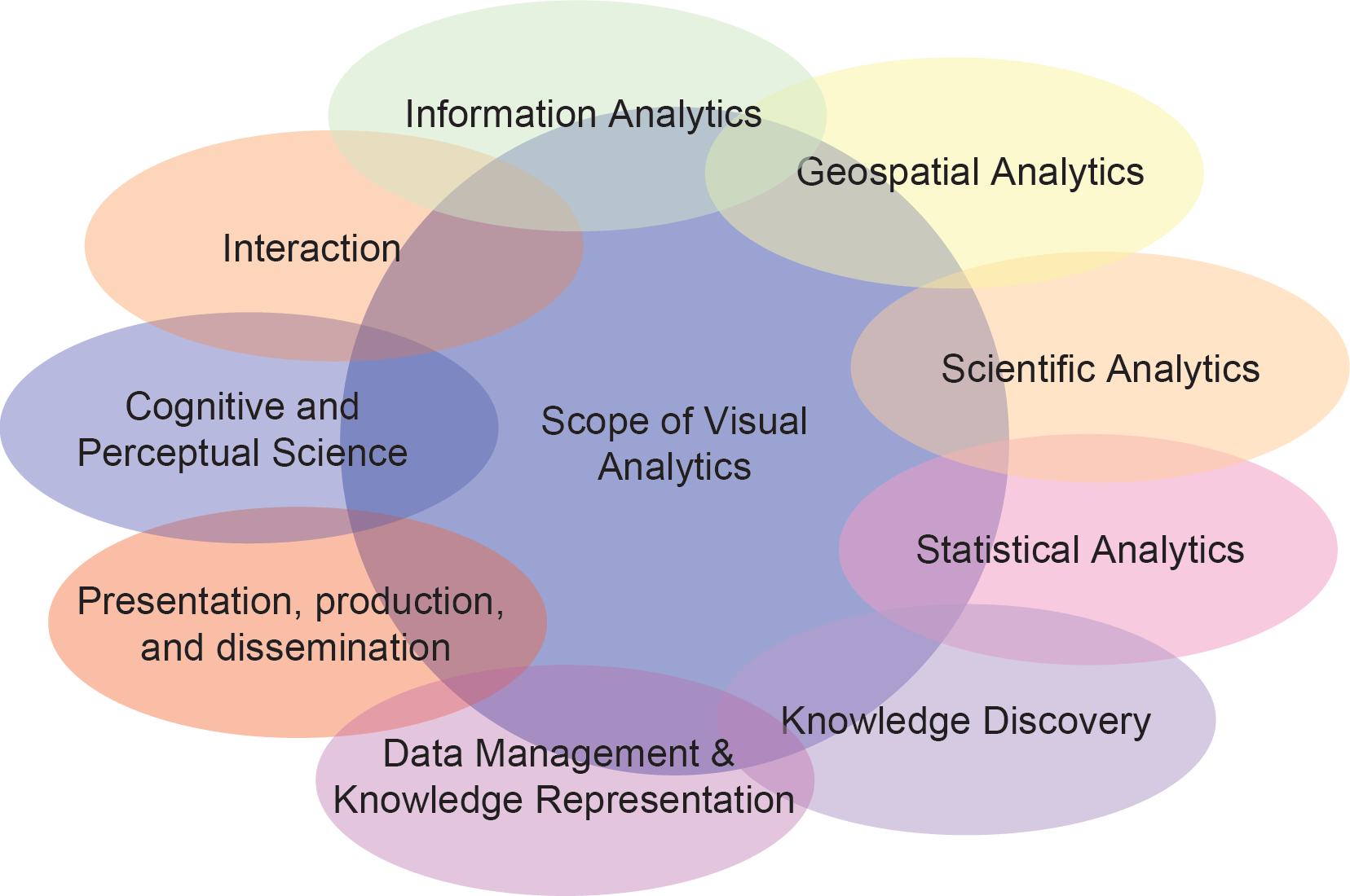
Visual Analytics Foundations
General Research in Defining Visual Analytics
The information overload is a well-known phenomenon of the information age, since due to the progress in computer power and storage capacity over the last decades, data is produced at an incredible rate, and our ability to collect and store these data is increasing at a faster rate than our ability to analyze it. But, the analysis of these massive, typically messy and inconsistent, volumes of data is crucial in many application domains. For decision makers, analysts or emergency response teams it is an essential task to rapidly extract relevant information from the flood of data.
Today, a selected number of software tools is employed to help analysts to organize their information, generate overviews and explore the information space in order to extract potentially useful information. Most of these data analysis systems still rely on interaction metaphors developed more than a decade ago and it is questionable whether they are able to meet the demands of the ever-increasing mass of information. In fact, huge investments in time and money are often lost, because we still lack the possibilities to properly interact with the databases.
Visual analytics aims at bridging this gap by employing more intelligent means in the analysis process. The basic idea of visual analytics is to visually represent the information, allowing the human to directly interact with the information, to gain insight, to draw conclusions, and to ultimately make better decisions. The visual representation of the information reduces complex cognitive work needed to perform certain tasks. People may use visual analytics tools and techniques to synthesize information and derive insight from massive, dynamic, and often conflicting data by providing timely, defensible, and understandable assessments.
General Research in Evaluating Color Perception
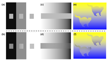
Research in color perception is of fundamental interest in the field of informatiaon visualization and visual analytics. Relations between features and groups appear as visual patterns in the visualization. However, optical illusions may bias the perception at the first level of the analysis process. For instance, in pixel-based visualizations contrast effects make pixels appear brighter if surrounded by a darker area, which distorts the encoded metric quantity of the data points. Even if we are aware of these perceptual issues, our visual cognition system is not able to compensate these effects accurately. To overcome this limitation, we present a color optimization algorithm based on perceptual metrics and color perception models to reduce physiological contrast or color effects. We evaluate our technique with a user study and find that the technique doubles the accuracy of users comparing and estimating color encoded data values. Since the presented technique can be used in any application without adaption to the visualization itself, we are able to demonstrate its effectiveness on data visualizations in different domains. Read more about this topic here.
Color mappings yet do not consider the surround of pixels in visualizations and cannot guarantee the visibility of structures in the final visualization. This is one of the general problems of visualizations, for example, to enhance the visibility of structures such as streets on maps or veins in the human body but also in abstract data visualizations where sets of pixels form important structural information. Given these shortcomings of static color-mapping schemes, we propose a novel algorithm for dense data displays to dynamically adapt colors based on local data properties. This approach retains the visibility of local details without using additional visualization space and aims at keeping the global distortion small. Our method thereby introduces contrast effects in order to enhance the visibility of structures. We present how contrasts can be used to enhance dense-data visualizations that use color for encoding metric quantities of numerical data. Note, that this algorithm can be applied to any image or data visualization to enhance the visibility of known structures. Read more this topic here.
General Research in Evaluating Glyph Designs
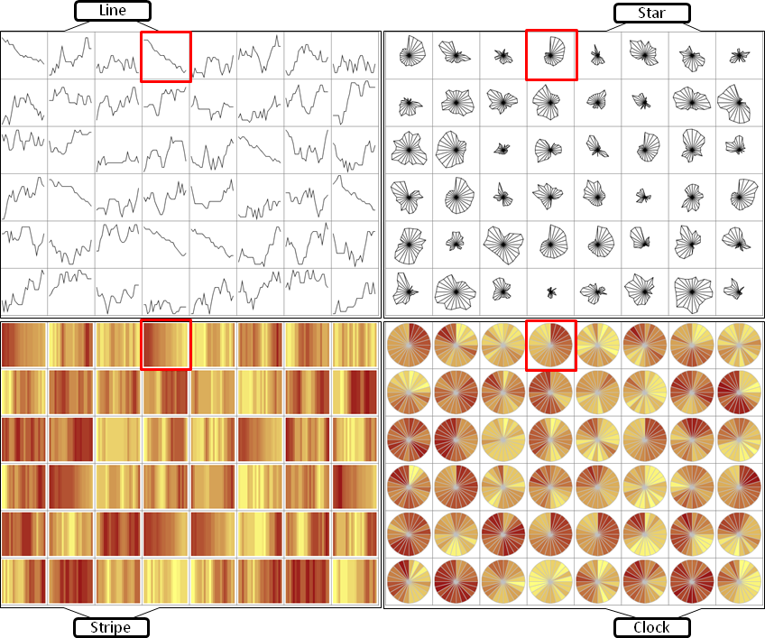
Time series data is the basis for decision making in many different application domains – such as finance, network security, or traffic management. Detecting trends, spotting peaks, or investigating single points in time from a visual representation are daily analysis tasks of vital importance.
Yet, due to glyphs’ power in presenting multiple time series for comparison, a multitude of designs have been proposed. Different visual variables such as length, color, or position can be used to encode two aspects of temporal data in one glyph: a) the location of a data point in time, and b) the quantitative data value. When confronted with the task of choosing an appropriate glyph design, a visualization designer or practitioner currently has little guidance on which encodings would be most appropriate for which tasks and on which visual features and factors influence people’s perception of data encoded in glyphs. In order to address this lack of guidance on the use of temporal glyphs, we ran a controlled experiment to compare four carefully selected glyphs using two different data densities. Read more for example in this publication.