Visualization Tools for Temporal Network Traffic
The following glyph-based approaches represent large time-series in matrix or hierarchical layouts. With the help of these tools large amounts of hosts can be explored in a computer networks to identify suspicious behavior or interesting usage patterns. These techniques can also be applied to other domains and tend to be quite generic.
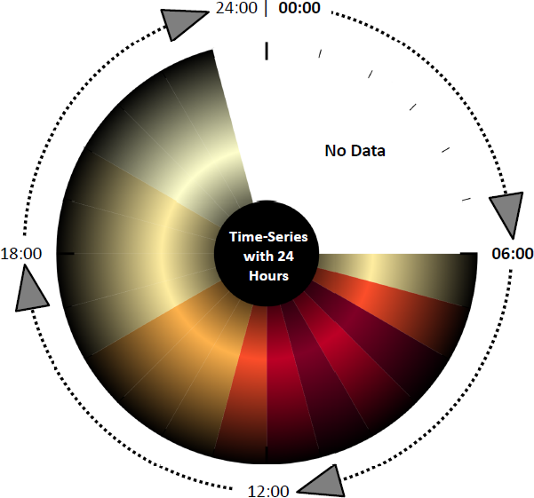
ClockView: Monitoring Large IP Spaces
ClockView is using Visual Analytics methods by combining automatic algorithms with strong visualizations. The tool supports network analysis tasks by
- Monitoring huge networks with thousands of hosts
- Providing details on demand
- Including external data sources and
- Enabling a feedback loop.
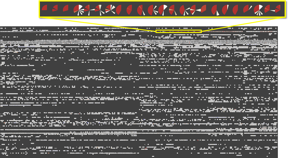
Each glyph represents the daily activity of one computer in a network. It is divided into 24 slices of equal size. Each slice displays the traffic of the corresponding hour of the day (00:00-23:59). Color encodes the amount of traffic from white (less traffic) to red (high traffic). Dark gray areas signalize a time interval with no traffic.
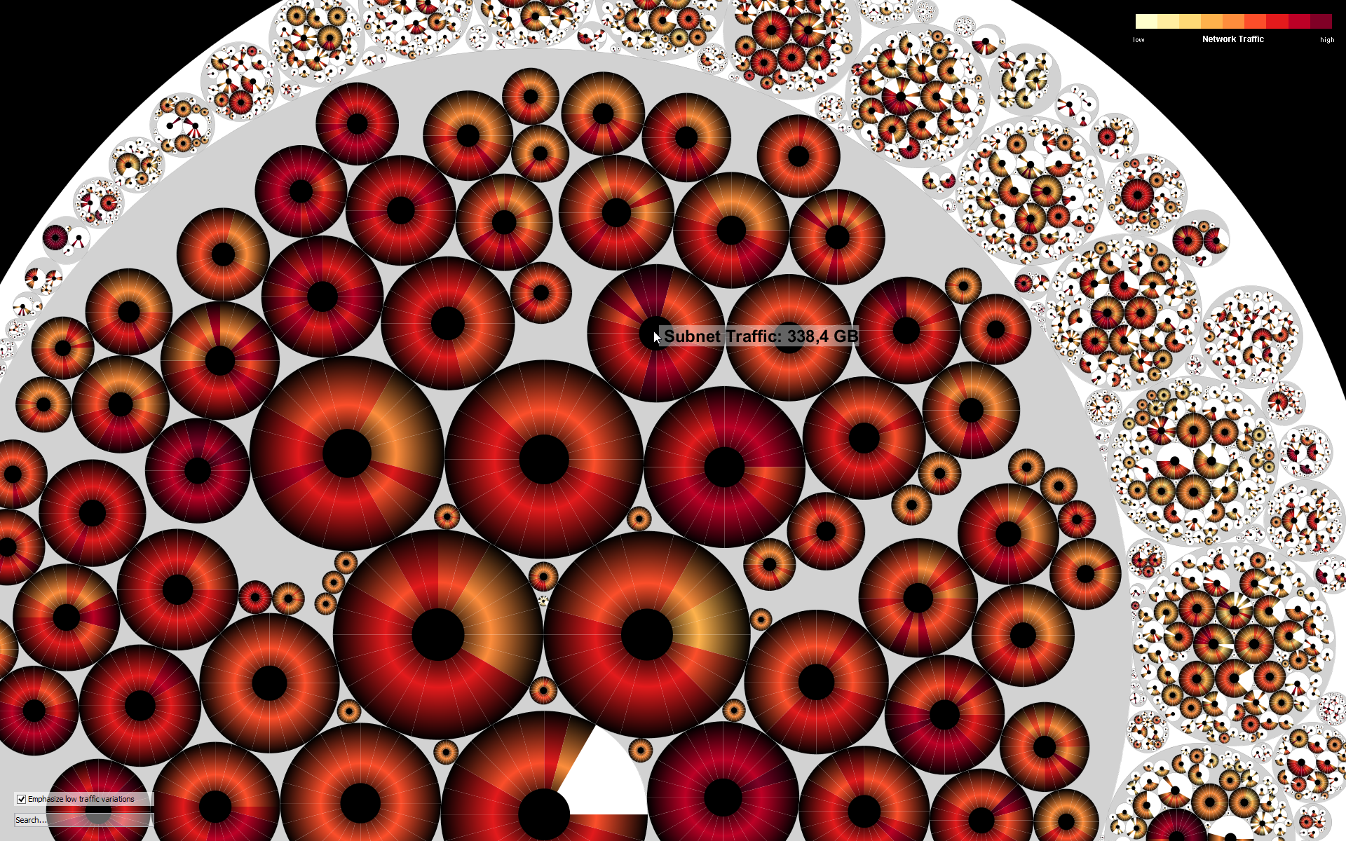
ClockMap: Enhancing Circular Treemaps with Temporal Glyphs for Time-Series Data
Treemaps are a powerful method to visualize especially time-invariant hierarchical data. Most attention is drawn to rectangular treemaps, because their space-filling layouts provide good scalability with respect to the amount of data that can be displayed. Since circular treemaps sacrifice the space-filling property and since higher level circles only approximately match the aggregated size of their descendants, they are rarely used in practice. However, for drawing circular glyphs (see picture above on the right) their shape preserving property can outweigh these disadvantages and facilitate comparative tasks within and across hierarchy levels.
We introduced the interactive ClockMap visualization in 2012, which effectively supports the user in exploring and finding patterns in hierarchical time-series data through drill-down, semantic zoom and details-on-demand. In this study, the technique’s applicability is demonstrated on a real-world dataset about network traffic of a large computer network and its advantages and disadvantages are discussed in the context of alternative layouts for better user experience.
More information about this and related work can be found in the following publications.